Hampton Roads Incident Reports - R
Load Libraries
library(tidyverse)
library(dplyr)
library(lubridate)
library(sf)
library(tidygeocoder)
library(httr)
library(ggplot2)
library(gganimate)
library(tigris)
library(rlang)
Description
From the previous project, we examined Norfolk PD’s Incident Report. In this section, we will examine the police incidents in the surrounding areas of Hampton Roads. The official website (data.virginia.gov) contains report of Virginina Beach, Chesapeake, and Portsmouth with geocoded addresses.
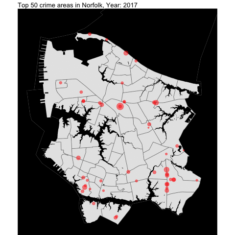
Norfolk
From the previous project, we examined Norfolk and created visualization data such as this:
We create the general function to be used for the neighboring independent cities.
top_50_crime_by_county_yearly <- function(incidentData,
                                   cityTract,
                                   waterTract,
                                   countyName,
                                   ...) {

top_50 <- incidentData %>%
  count(latitude, longitude, sort = TRUE) %>%
  head(50)

titleFrame = str_c("Top 50 crime areas in", countyName, ",Year: {frame_time}", sep = " " )
# creating the plot
city_50_offense_by_year <- incidentData %>%
  filter(longitude %in% top_50$longitude & latitude %in% top_50$latitude ) %>%
  count(latitude, longitude, Year.Reported) %>%
  mutate(`lat.long` = str_c(latitude,longitude)) %>%
  ggplot() +
  geom_sf(data=cityTract) +
  geom_sf(data =waterTract , fill = "black", color = NA, aes(geometry = geometry)) +
  theme_void() +
  theme(panel.background=element_rect(fill='black')) +
  geom_point(aes(x=longitude, y = latitude, size = n), color = "red", alpha = .5, show.legend =  FALSE) +
  scale_size(range=c(1,12)) +
  transition_time(Year.Reported) +
  labs(title=titleFrame) +
  ease_aes("linear")
}
Virginia Beach
# Download the Virginia beach file
# Info: -has most of the data already geocoded but does not contain up-to date
#       -missing about 2000 cases. About 2% so it may be neglible
vb_incident <- read.csv("https://data.virginia.gov/api/views/397q-vxx8/rows.csv?accessType=DOWNLOAD")
vb_incident <- vb_incident %>%
  mutate(`Date.Reported` = mdy_hms(`Date.Reported`),
         `Year.Reported` = int(year(`Date.Reported`)),
         `Hour.Reported` = hour(Date.Reported),
         `Month.Reported` = int(month(Date.Reported)))
As shown below, the data set starts at 2019, unlike Norfolk data set that starts at 2017.
table(vb_incident$Year.Reported)##
## 2019 2020 2021 2022
## 27720 25262 25763 23667Map Overlay By Year
As seen in Norfolk report, we will examine the top locations of crime across the VB city by year.
#First we create the base map for VB using **tigris**.

vb_tract <- tracts(state = "51", county ="810")

# get the water area since its included in the boundary for VB
vb_water = area_water(state = "51", county ="810")

#Function to returin top 50 crime areas
vb_top_50_offenses_by_year <- top_50_crime_by_county_yearly(incidentData = vb_incident,
                                   cityTract =vb_tract,
                                   waterTract = vb_water,
                                   countyName = "Virginia Beach")
vb_top_50_offenses_by_year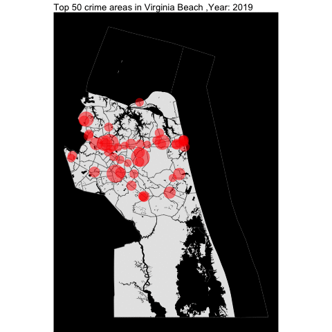
How about per hour???
By making minimal changes to the function, we can create the following visualization:
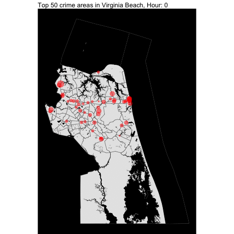
The top 50 crime areas are more active after 12 pm.
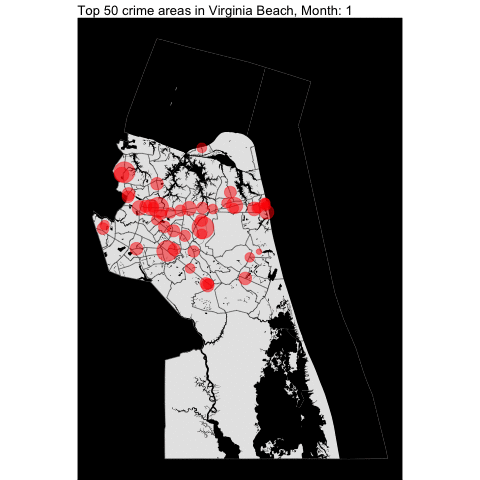
How about per month???
Top 5 offense
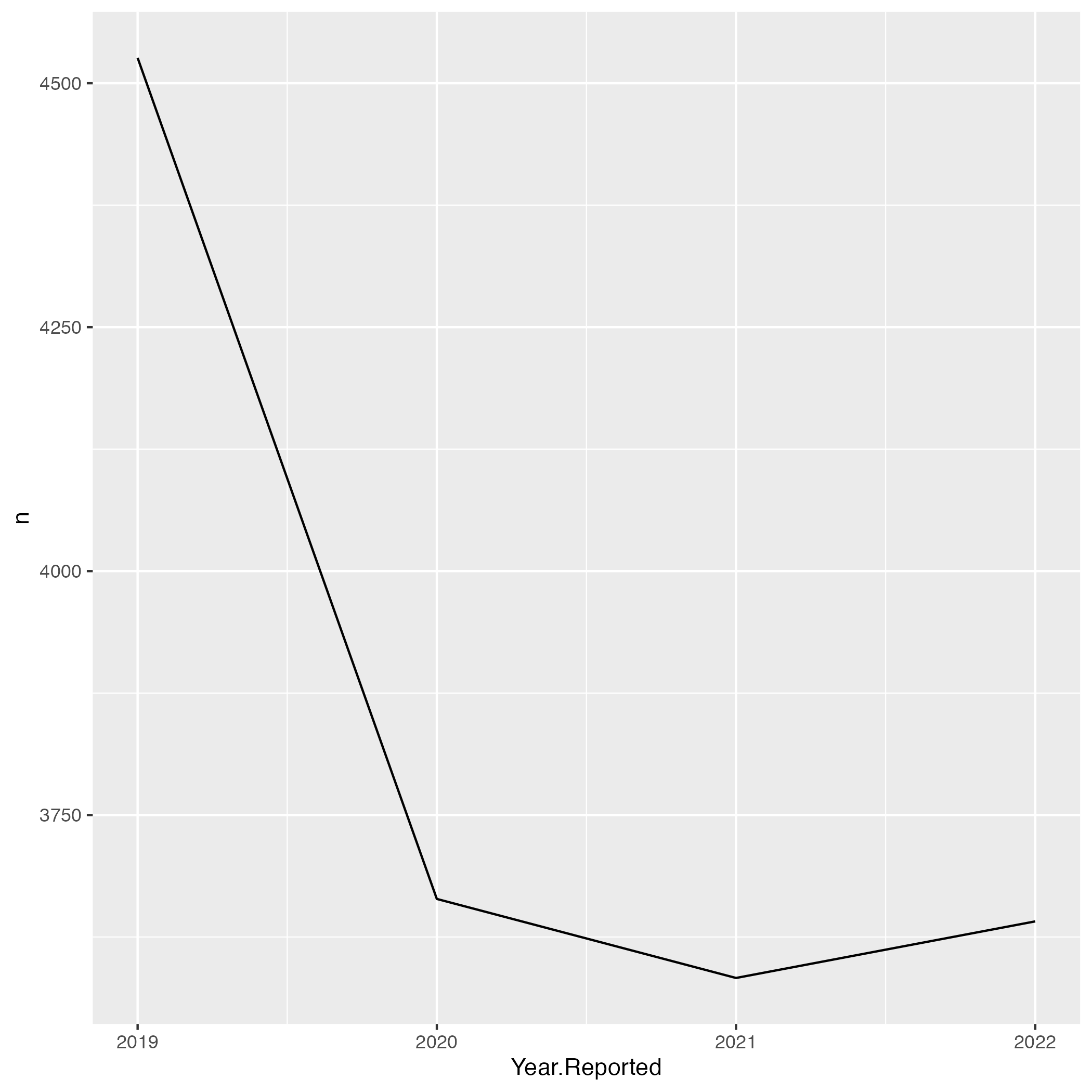
Next, we examine the top 5 Offenses:
vb_incident_offense <- vb_incident %>%
  count(Offense.Description, sort = TRUE) %>%
  head(5)
vb_incident_offense
## Offense.Description n
## 1 LARCENY, FROM MOTOR VEHICLE 11251
## 2 HIT & RUN 9425
## 3 DESTRUCTION OF PROPERTY, PRIVATE PROPERTY 9067
## 4 ASSAULT, SIMPLE 7869
## 5 LARCENY, ALL OTHERS 7242#we filter the dataset to only contain the top 5
by_offense <- vb_incident %>%
filter(Offense.Description %in% vb_incident_offense$Offense.Description) %>%
count(Offense.Description,Year.Reported)
ggplot() +
geom_line(data = by_offense, mapping = aes(x = Year.Reported, y = n, group = Offense.Description, color = Offense.Description)) +
labs(title = "Top 5 offenses over the years")
ggsave("top_5_offense.png")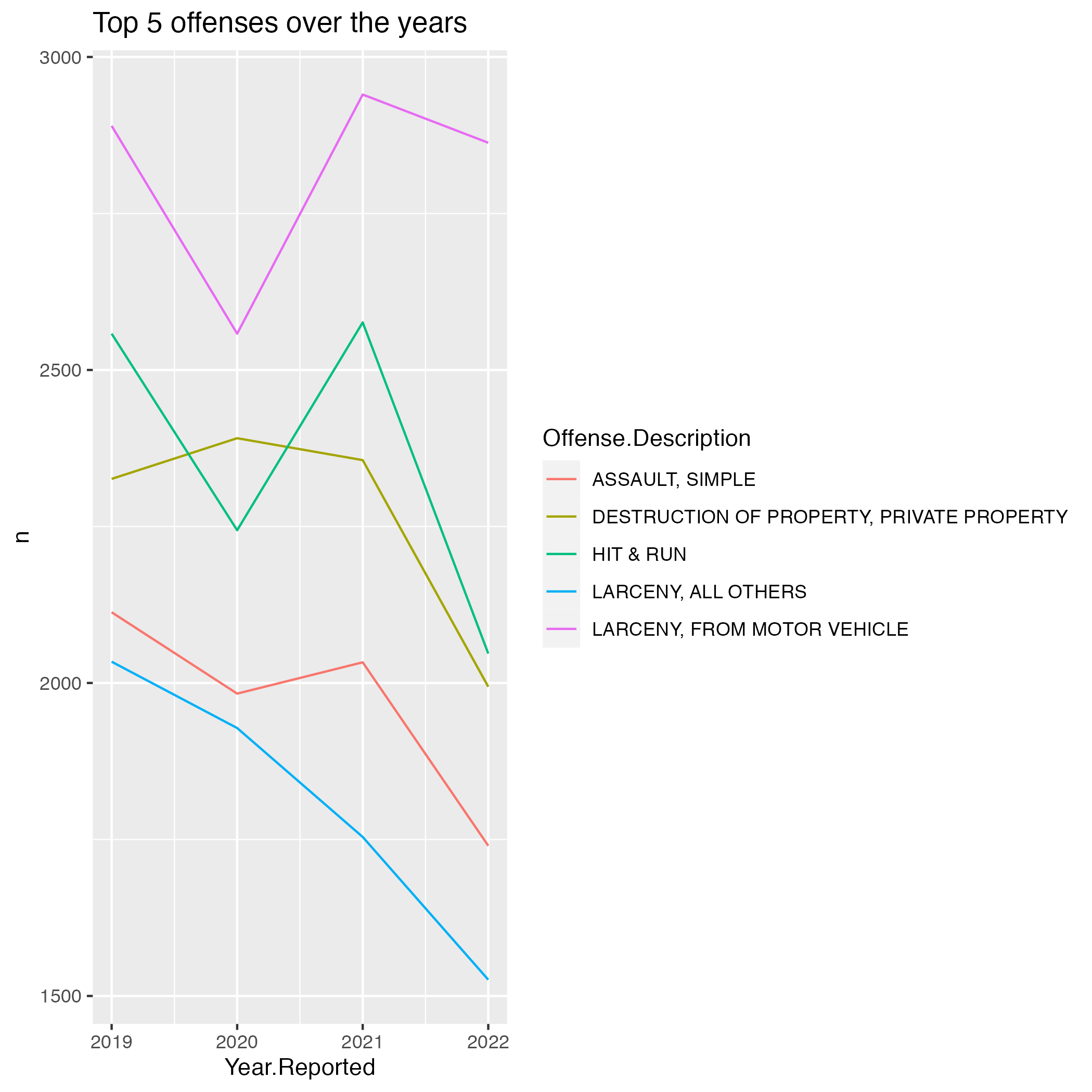
It’s quite interesting that the top 5 offenses in Virginia Beach are decreasing coming into 2022. A question arises, which Offenses did increase the most between 2019-2022 by percentage?
Let’s investigate:
vb_increased_incident <- vb_incident %>%
  count(Offense.Description,Year.Reported) %>%
  filter(Year.Reported %in% c(2019,2022)) %>%
  group_by(Offense.Description) %>%
  mutate(PercentageIncrease = ((n - lag(n))/n)*100) %>%
  filter(Year.Reported == 2022) %>%
  na.omit() %>%
  arrange(desc(PercentageIncrease)) %>%
  select(-c(Year.Reported,n)) %>%
  head(5)

vb_increased_incident
## # A tibble: 5 × 2
## # Groups: Offense.Description [5]
## Offense.Description PercentageIncrease
## <chr> <dbl>
## 1 LARCENY,OF M.V. PARTS OR ACCESSORIES 97.2
## 2 WEAPON LAW, SHOOTING IN A VEHICLE 78.9
## 3 ROBBERY, CARJACKING 78.6
## 4 PEEPING TOM 77.8
## 5 CURFEW 75For visualization:
# we filter the dataset to only contain the top 5 offenses
laggin_offense <- vb_incident %>%
  filter(Offense.Description %in% vb_increased_incident$Offense.Description) %>%
  count(Offense.Description,Year.Reported)

ggplot() +
  geom_line(data = laggin_offense, mapping = aes(x = Year.Reported, y = n, group = Offense.Description, color = Offense.Description)) +
  labs(title = "Top 5 offenses that increased in highest percentage")

ggsave("top_5_offense_percentage.png")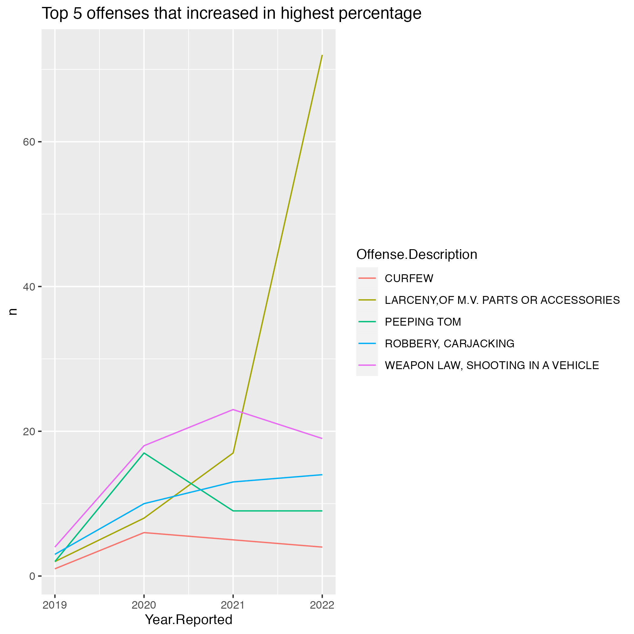
How about the top 5 offense that increase by N?
Let’s investigate:
vb_increased_incident_by_N <- vb_incident %>%
  count(Offense.Description,Year.Reported) %>%
  filter(Year.Reported %in% c(2019,2022)) %>%
  group_by(Offense.Description) %>%
  mutate(NIncrease = (n - lag(n))) %>%
  filter(Year.Reported == 2022) %>%
  na.omit() %>%
  arrange(desc(NIncrease)) %>%
  select(-c(Year.Reported,n)) %>%
  head(5)

vb_increased_incident_by_N
## # A tibble: 5 × 2
## # Groups: Offense.Description [5]
## Offense.Description NIncrease
## <chr> <int>
## 1 WEAPON LAW VIOLATIONS 349
## 2 MOTOR VEHICLE THEFT 278
## 3 WEAPON LAW, CONCEALED WEAPON(S) 176
## 4 FRAUD, IDENTITY THEFT 107
## 5 RECOVERED VEHICLE- STOLEN OTHER JURISDICTION 92Given a longitude and latitude, what crimes are more likely to occur?
crime_and_offense <- vb_incident %>%
  count(latitude, longitude, Offense.Description, sort= TRUE) %>%
  head(50) %>%
  ggplot() +
  geom_sf(data=vb_tract) +
  geom_sf(data =vb_water , fill = "black", color = NA, aes(geometry = geometry)) +
  theme_void() +
  theme(panel.background=element_rect(fill='black')) +
  geom_point(aes(x=longitude, y = latitude, size = n, color =Offense.Description), alpha = .5) +
  labs(title = "Top 50 areas and their most dominant crime")

crime_and_offense

ggsave("crime_and_offense.png")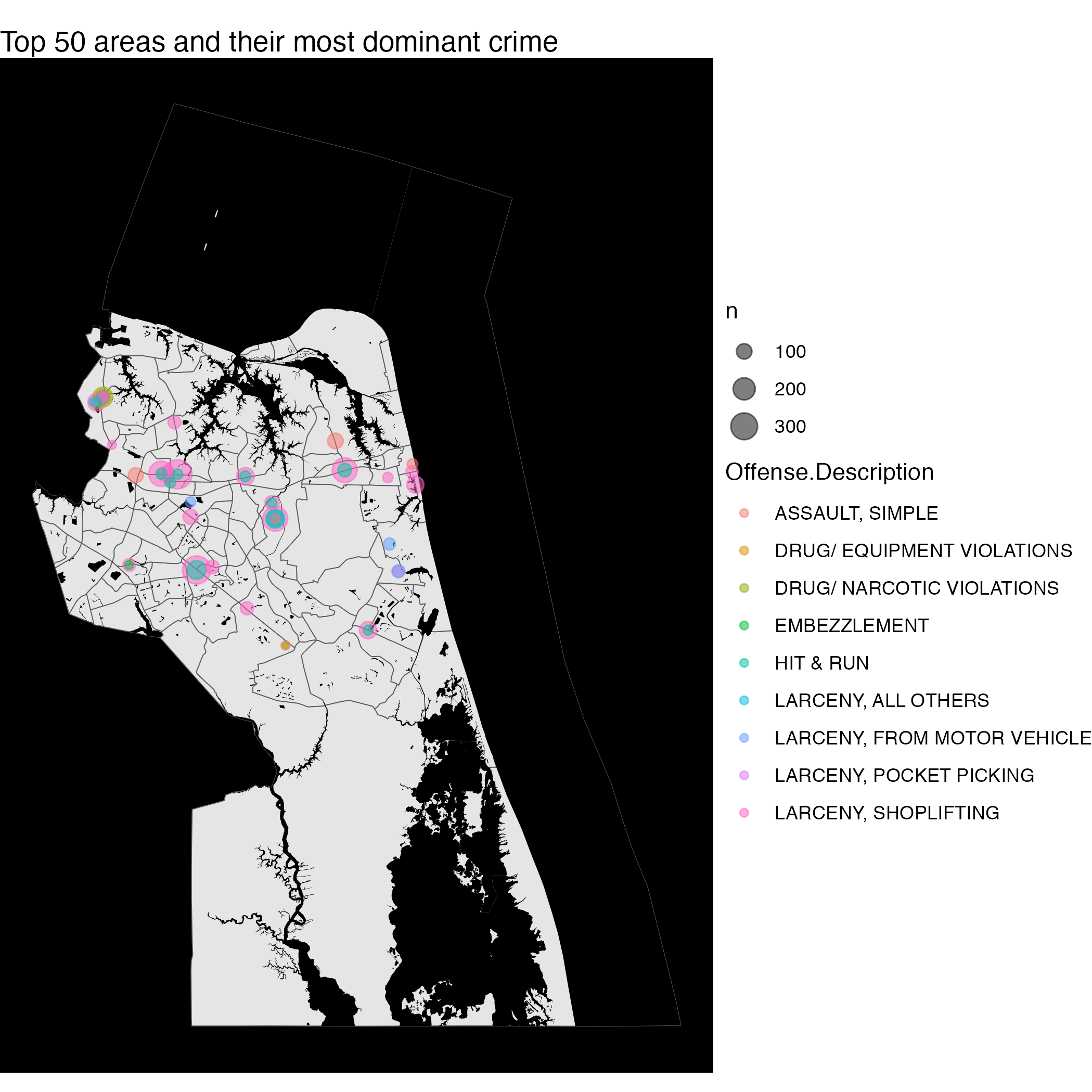
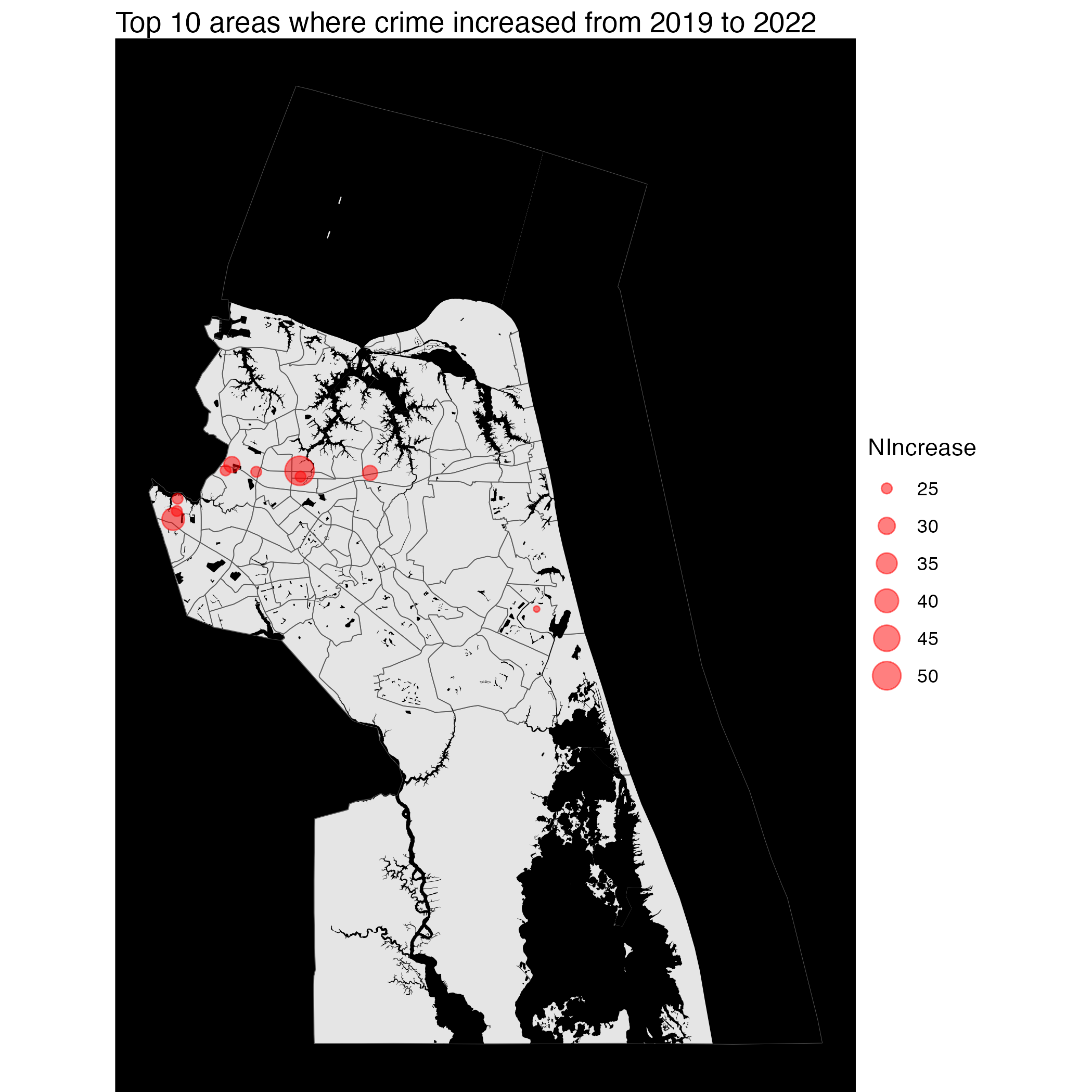
Given a longitude and latitude, what crimes increased or decreased the most by count?
Increased
vb_increased_incident_by_lat_long_N <- vb_incident %>%
  count(latitude,longitude,Year.Reported) %>%
  group_by(latitude,longitude) %>%
  mutate(NIncrease = (n - lag(n))) %>%
  filter(Year.Reported == 2022) %>%
  na.omit() %>%
  arrange(desc(NIncrease)) %>%
  select(-c(Year.Reported,n))


vb_increased_incident_by_lat_long_N
## # A tibble: 4,579 × 3
## # Groups: latitude, longitude [4,579]
## latitude longitude NIncrease
## <dbl> <dbl> <int>
## 1 36.8 -76.1 52
## 2 36.8 -76.2 38
## 3 36.8 -76.2 29
## 4 36.8 -76.1 28
## 5 36.8 -76.2 25
## 6 36.8 -76.2 25
## 7 36.8 -76.1 25
## 8 36.8 -76.2 25
## 9 36.8 -76.2 25
## 10 36.8 -76.0 24
## # … with 4,569 more rowsTo visualize:
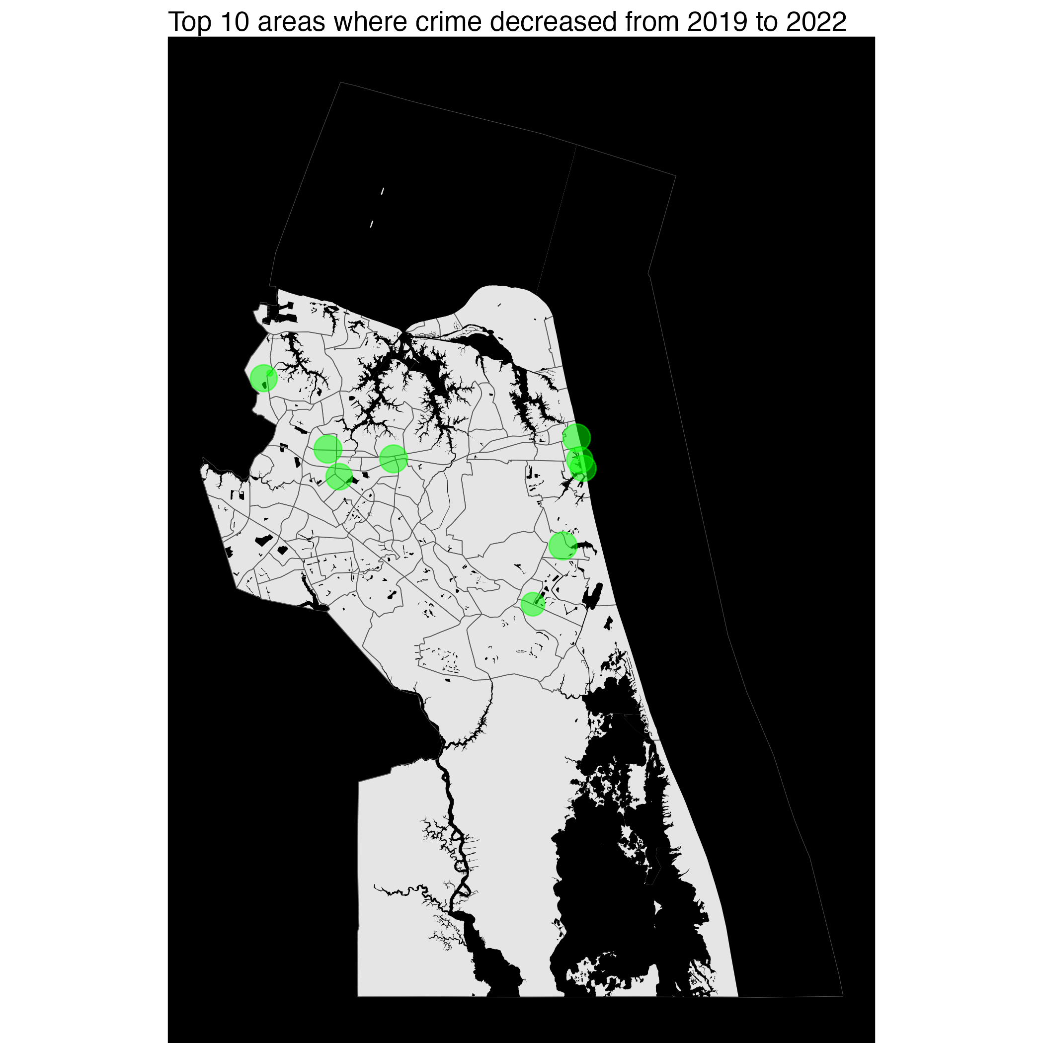
Decreased
vb_decreased_incident_by_lat_long_N <- vb_incident %>%
  count(latitude,longitude,Year.Reported) %>%
  group_by(latitude,longitude) %>%
  mutate(NDecrease = (n - lag(n))) %>% #the absolute since its negative
  filter(Year.Reported == 2022) %>%
  na.omit() %>%
  arrange((NDecrease)) %>%
  select(-c(Year.Reported,n))


vb_decreased_incident_by_lat_long_N
## # A tibble: 4,579 × 3
## # Groups: latitude, longitude [4,579]
## latitude longitude NDecrease
## <dbl> <dbl> <int>
## 1 36.9 -76.2 -81
## 2 36.8 -76.0 -48
## 3 36.8 -76.0 -38
## 4 36.8 -76.0 -37
## 5 36.8 -76.1 -36
## 6 36.9 -76.2 -34
## 7 36.9 -76.0 -31
## 8 36.8 -76.1 -30
## 9 36.8 -76.1 -30
## 10 36.8 -76.0 -29
## # … with 4,569 more rowsTo visualize:
Cons: There is a major problem with the dataset and it is from Offense.Description. As shown in Top 5 offenses over the years, Larceny From Motor Vehicles (Theft isa different category) has decreased compared to Norfolk City. However, it may be due to other cases being misrepresented as Larceny of MV Parts or Accessories, which is shown in the previous graph to have increased in cases. Though the cases only total less than 100 (no great impact), it shows the redundance of some values in the Offense.Description.
Chesapeake
# Download the Chesapeake file
# Info: -has most of the data already geocoded but does not contain up-to date
#       -missing about 1000 cases
chpk_incident <- read.csv("https://data.virginia.gov/api/views/h7q4-f9sh/rows.csv?accessType=DOWNLOAD")

chpk_incident <- chpk_incident %>%
  mutate(`Reported.Date` = mdy_hms(`Reported.Date`),
         `Year.Reported` = int(year(`Reported.Date`)),
         `Hour.Reported` = hour(Reported.Date),
         `Month.Reported` = int(month(Reported.Date)))
As for Chesapeake, the start of the dataset is at 2018.
table(chpk_incident$Year.Reported)##
## 2018 2019 2020 2021 2022
## 13002 13342 11604 10599 8020Top 5 Offenses
Next, we examine the top 5 Offenses:
chpk_incident_offense <- chpk_incident %>%
  count(Category, sort = TRUE) %>%
  head(5)
chpk_incident_offense
## Category n
## 1 Assault 10705
## 2 Theft / Larceny 8618
## 3 Drug / Alcohol Violations 6860
## 4 Vehicle Break-In / Theft 6702
## 5 Fraud 6239Unlike Norfolk and VB, Chesapeake #1 offense is Assault.
Map Overlay by Year
chpk_tract <- tracts(state = "51", county ="550")
# get the water area since its included in the boundary for Chesapeake
chpk_water = area_water(state = "51", county ="550")
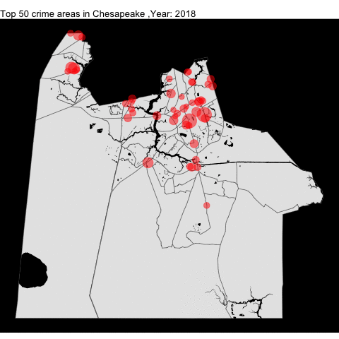
# chesapeake top 50 crime areas
chpk_top_50_offense_by_year <- top_50_crime_by_county_yearly(incidentData = chpk_incident,
cityTract =chpk_tract,
waterTract = chpk_water,
countyName = "Chesapeake")
chpk_top_50_offense_by_year
anim_save("chpk_top_50_offense_by_year.gif")Much like VB, the crime rate in Chesapeake decreased.
Portsmouth
# Download the Portsmouth file
# Info: -has most of the data already geocoded but does not contain up-to date
#       -missing about 1000 cases
prtsmth_incident <- read.csv("https://data.virginia.gov/api/views/ib39-s45k/rows.csv?accessType=DOWNLOAD")

prtsmth_incident <- prtsmth_incident %>%
  mutate(`date_time` = mdy_hms(`date_time`),
         `Year.Reported` = int(year(`date_time`)),
         `Hour.Reported` = hour(date_time),
          `Month.Reported` = int(month(date_time)))
As for Portsmouth, the start of the dataset is at 2021.
table(prtsmth_incident$Year.Reported)##
## 2021 2022
## 9333 13026Map Overlay by month
Since the dataset start at 2021, it would be better to show the changes by month instead of year.
prtsmth_tract <- tracts(state = "51", county ="740")

# get the water area since its included in the boundary for Portsmouth
prtsmth_water = area_water(state = "51", county ="740")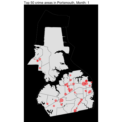
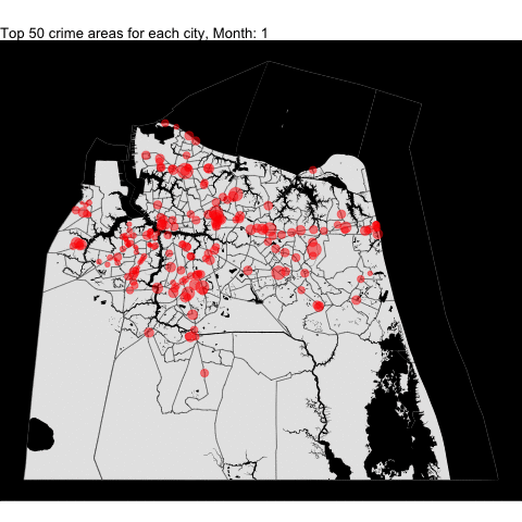
VB, Norfolk, Chesapeake,and Portsmouth top crime areas by month
We combined all the top 50 crime areas for each independent cities into one plot by month since each cities have varying starting years. Making some changes to the code, we can combine all the following tracts (including the Norfolk from the previous project) and data in one plot.
For example, we download all the tracts:
cities_tract <- tracts(state = "51", county = c("710", "740", "550","810"))

# get the water area since its included in the boundary for Portsmouth
water = area_water(state = "51", county = c("710", "740", "550","810"))